Sometimes we need add a second axis on the schedule in Excel , for example, we want the amount of sold goods to be displayed on one side, and the number of units of the sold goods on the other. Also, the second axis allows us to reduce the number of graphs and improves data analysis. Let's see how it can be implemented.
Suppose we have such a table:

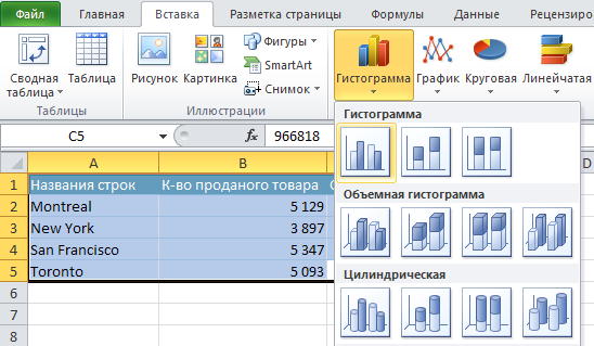
Let's create a graph based on this table. To do this, select our entire table, go to the menu File - Insert - Histogram and choose the type of graph we need:
Click and get the following graph:
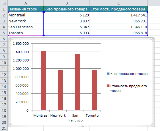
We see that the values for the two columns are displayed on the left. For correct display " Quantities of goods sold "we need to create a second axis.
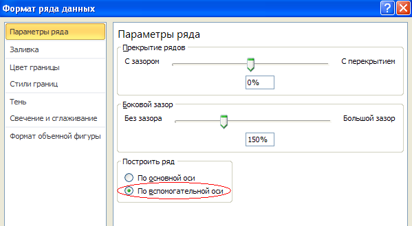
To do this, select the blue columns on the graph, press the right mouse button and select " Data series format ". Next, select the auxiliary axis:
Let's press
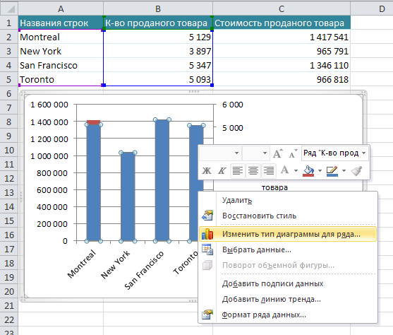
Voila! We got the result we needed:
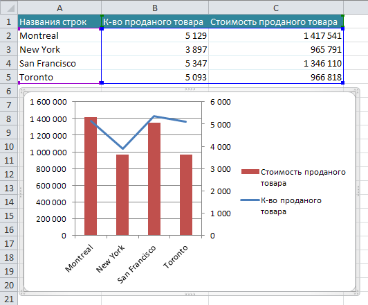
Now the amount of sold goods is displayed on the left, and, accordingly, the number of sold goods is on the right.