High-quality visualization of a large amount of information is almost always a non-trivial task, therefore, displaying all the data often leads to overloading of the diagram, its confusion and, as a result, to incorrect perception and conclusions.
Here, for example, data on exchange rates for several months:
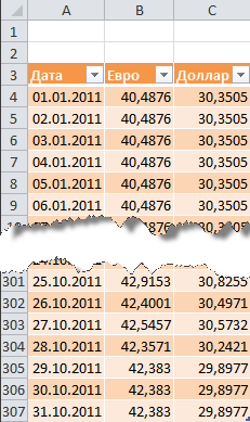
As you can see, it is not a good idea to plot the whole table. A beautiful solution in a similar situation can be the creation of an interactive diagram, which the user can adjust to himself and the situation. Namely:
It may look something like this:
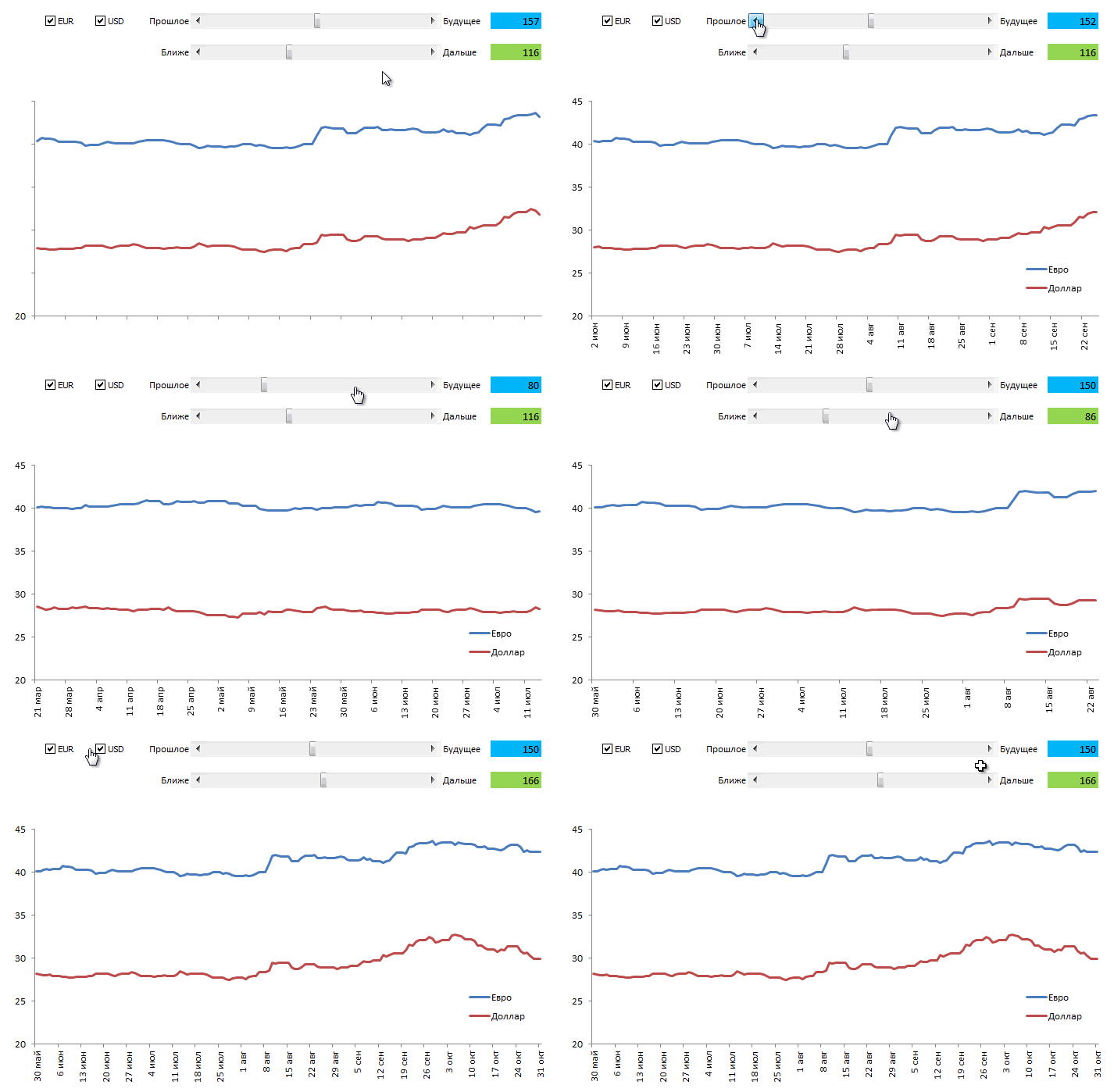
Do you like it? Then we went ...
In most cases, a simple but powerful technique is used to implement the interactivity of the diagram - the diagram is not built according to the original, but according to a separate, specially created table with formulas, which displays only the necessary data. In our case, the output data will be transferred to this additional table only for those currencies that the user selected using the checkboxes:
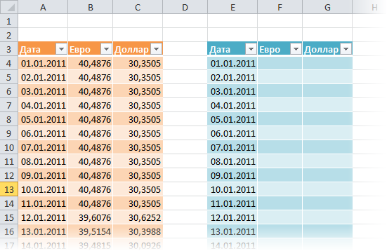
In Excel 2007/2010, you can apply a command to the created ranges Format as a table (Format as Table) from the tab Main (Home) :
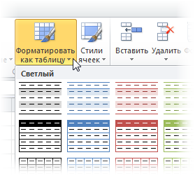
This will give us the following advantages:
In Excel 2007/2010, you need to display the tab for this Developer (Developer) , and in Excel 2003 and older versions - the toolbar Forms (Forms) . For this:
What appeared toolbars or tabs Developer (Developer) in the drop-down list Insert (Insert) choose a tool Flag (Checkbox) and draw two checkmarks to enable/disable each of the currencies:
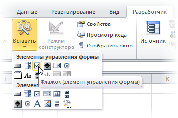
You can change the text of the flags by clicking on them with the right mouse button and selecting the command Change the text (Edit text) .

Now let's bind our flags to any cells to determine whether the flag is enabled or not (in our example, these are the two yellow cells at the top of the additional table). To do this, right-click on each added flag in turn and select a command Object format (Format Control) , and then set in the window Communication with the cell (Cell link) .
Our goal is for each check box to be tied to the corresponding yellow cell above the currency column. When the checkbox is enabled in the associated cell, it will be displayed TRUTH (TRUE) , when switching off - LIE (FALSE) . This will allow, in the future, to check the connected cells with the help of formulas and display in an additional table or the exchange rate value from the original table for constructing a graph, or #N/A (#N/A) , so that the graph is not built.
Now let's fill the secondary table with a formula that will translate the output data from the main table if the corresponding currency flag is enabled and the associated cell contains the word TRUTH (TRUE) :

Note that when using the command Format as a table (Format as Table) in the first step, the formula must use the name of the table and the name of the column. In the case of a regular range, the formula will look more familiar:
Note the partial anchoring of the reference to the yellow cell (F$1), so it should move to the right, but not down, when copying the formula to the entire range.
Now, when checking the flags, our additional table is filled either with data from the original table, or with an artificially created error # N/A, which does not give a line on the graph.
Now let's add scroll bars to the Excel sheet, with the help of which the user can easily move the graph along the time axis and change the scale of its increase.
Scroll bar (Scroll bar) we take it in the same place as the flags - on the toolbar Forms (Forms) or on a tab Developer (Developer) :
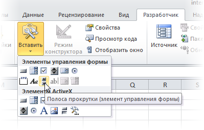
We draw two strips one by one on the sheet in any suitable place - for a shift in time and scale:

Each scroll bar must be associated with its own cell (blue and green cells in the picture), where the numerical value of the slider position will be displayed. We will then use it to determine the scale and offset. To do this, right-click on the drawn strip and select a command from the context menu Object format (Format control) . In the dialog box, you can set the associated cell and minimum-maximum, within any limits where the slider will walk:

Thus, after doing all of the above, you should have two scroll bars, when you move the sliders, along which the values in the related cells should change in the range from 1 to 307.
To display data on the graph only for a certain time interval, we will create a named range that will refer only to the required cells in the additional table. This range will be characterized by two parameters:
We will later use this named range as the raw data to build the chart.
To create such a range, we will use the function
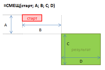
Some starting cell is taken as a starting point, then a shift relative to it by a given number of rows down and columns to the right is set. The last two arguments of this function are the height and width of the range we need. So, for example, if we wanted to reference a range of data with rates for 5 days starting on January 4th, we could use our function
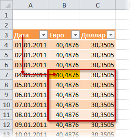
The trick is that the constants in this formula can be replaced with references to cells with variable content - in our case, the blue and green cells. You can do this by creating a dynamic named range with a function
Click the button to create a new named range Create (Create) and enter the range name and cell references in the window.
First, let's create two simple static named ranges with names, for example
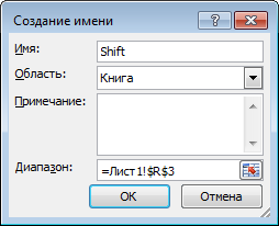

Now it's a little more complicated - let's create a range with a name
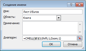
Note that the name of the current sheet is used before the name of the range - this narrows the scope of the named range, that is, it makes it available within the limits of the current sheet, and not the entire workbook. This is necessary for us to build a diagram in the future. In newer versions of Excel you can use the drop-down list to create a local sheet name Region .
Similarly, a named range is created
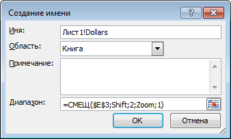
And the range completes the picture

The general picture should be approximately as follows:
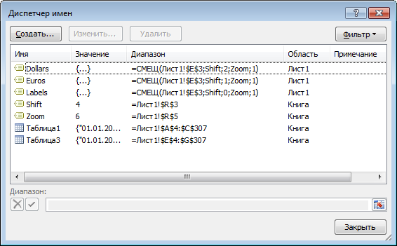
Let's select several rows in the upper part of the auxiliary table, for example, the range E3:G10 and build a type diagram based on it Schedule (Line) . To do this, in Excel 2007/2010, you need to go to the tab Insert (Insert) and in the group Chart (Chart) select a type Schedule (Line) , and in older versions select from the menu Inset - diagram (Insert - Chart) . If you highlight one of the lines on the created diagram, the function will be visible in the formula bar
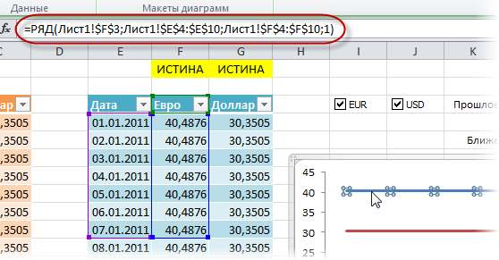
This function sets the data ranges and labels for the selected chart series. Our task is to replace the static ranges in its arguments with the dynamic ones we created earlier. This can be done directly in the formula bar by changing:
on:
Having performed this procedure sequentially for the data series of the dollar and the euro, we will get what we wanted - the chart will be built according to dynamic ranges
Thus, we have a fully interactive chart where we can display exactly the piece of data we need for analysis.